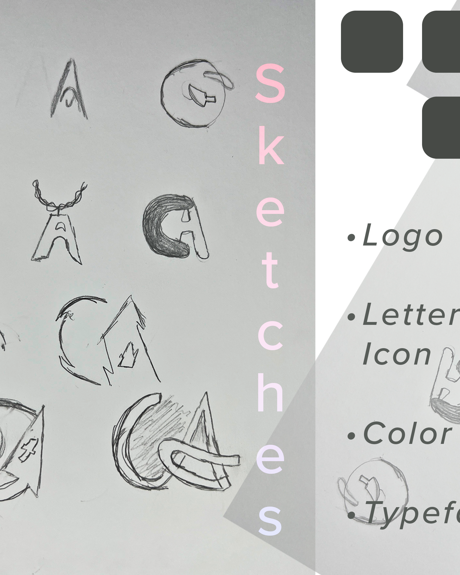
I wanted to design my branding; it is difficult when being the designer. The goal of the Identity exploration was to create a brand that would reflect both fields of design and photography. It was not easy straight away because iconography for design would not fit for photography and vice versa. With that in mind, I went ahead and created a wordmark that contains my initials but is also stylized enough to convey the idea of a creative.

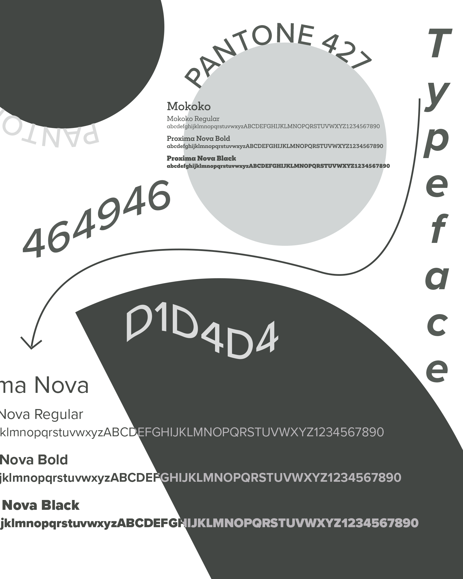
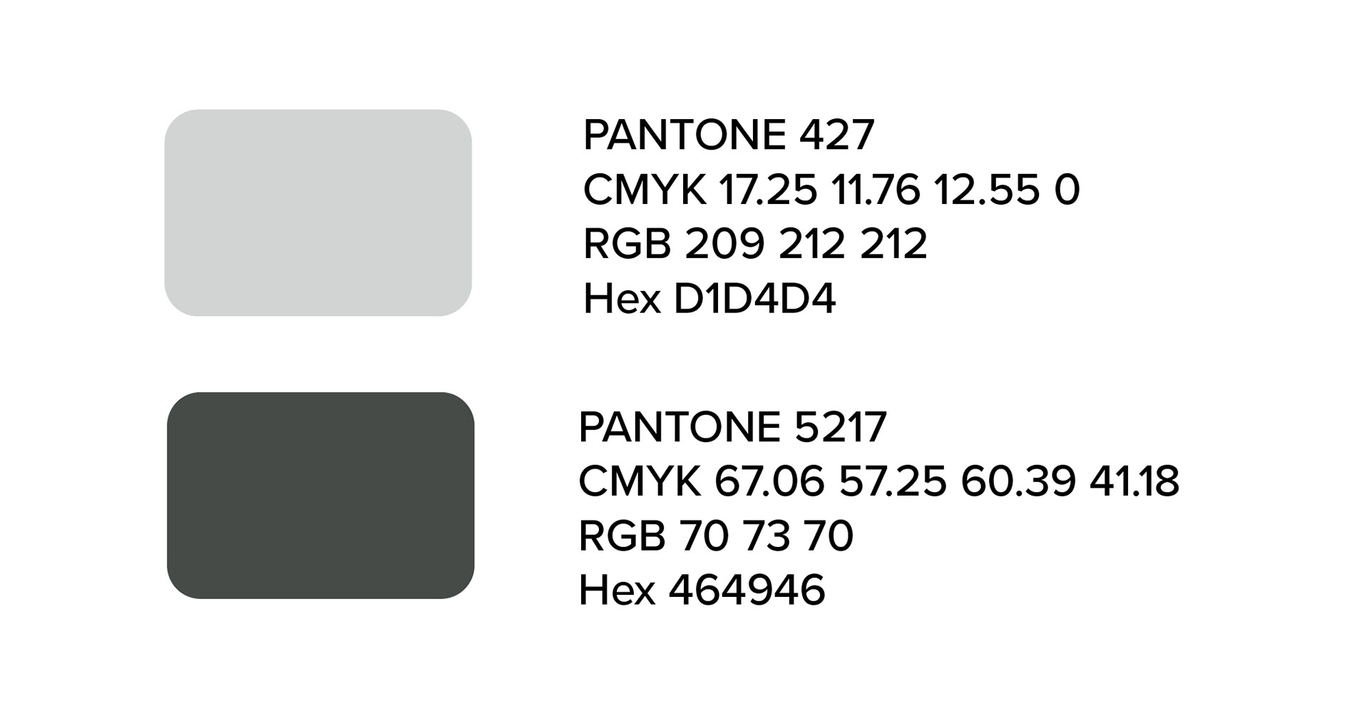
While the color palette could have been black and white, I went for something more professional. To encompass the overall reach of my brand (multimedia) I went with a color combination that can be usable in all fields of my experience sphere.
I wanted to challenge myself to visually represent a powerful idea such as that by creating a visual composition. I gathered some images from Unsplash. Some of these would later become part of the final design.
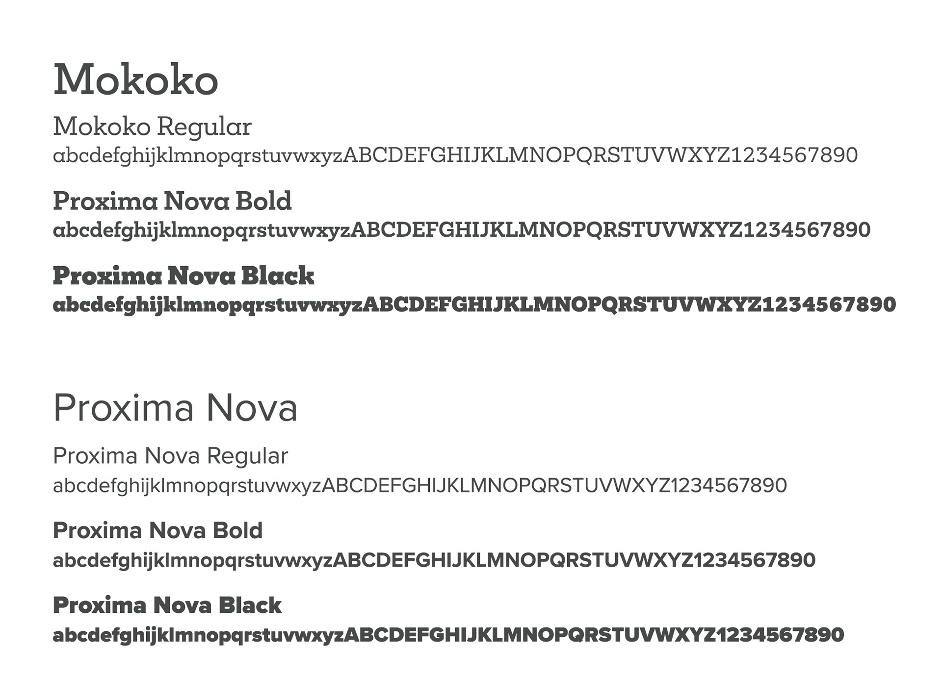
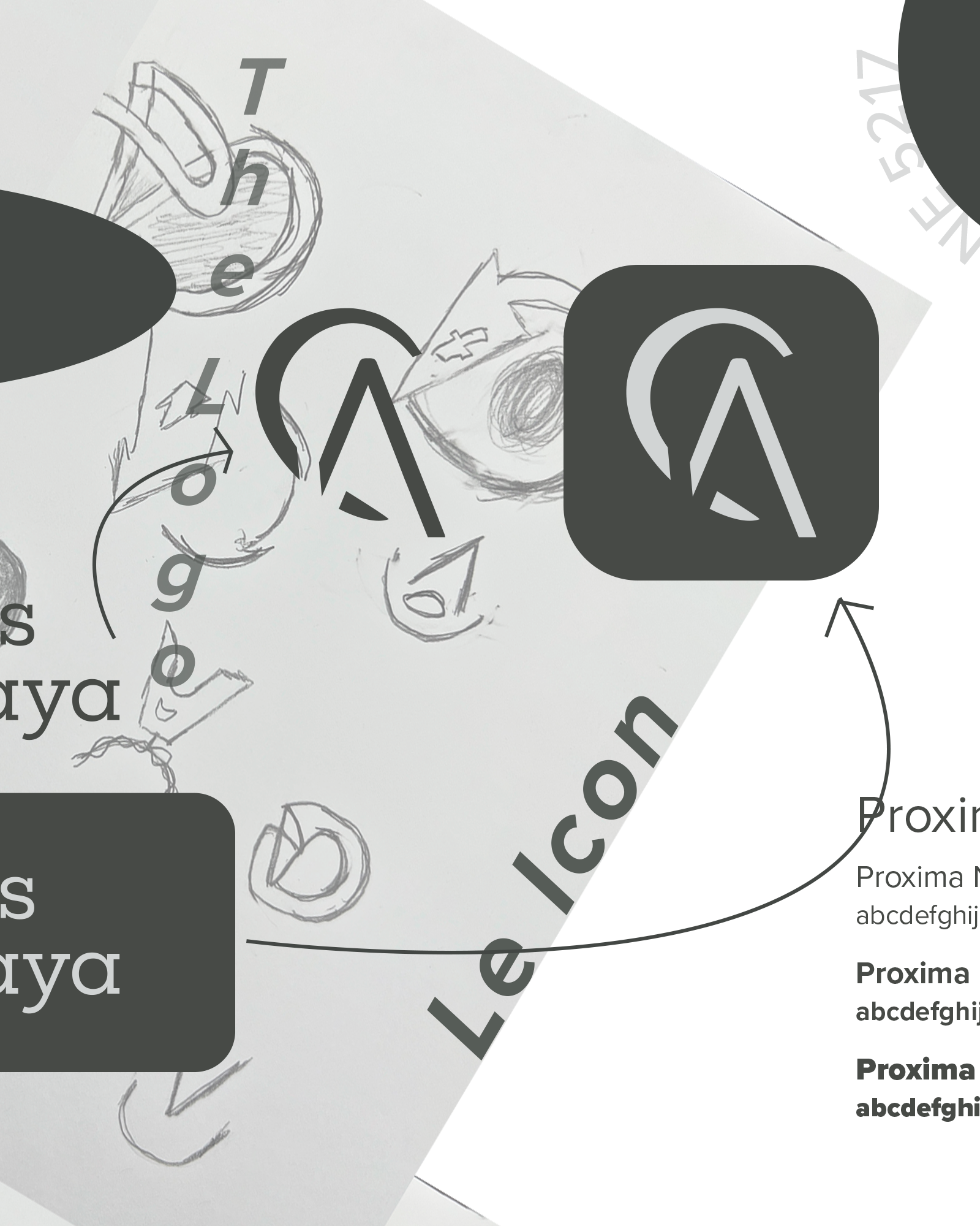
The typeface choice came about by the want to have a different approach typographically. With that said, while one of the typefaces was a sans serif, Mokoko was the missing piece by being a modern spin to the typical serif typeface.
Social Media Carousel