
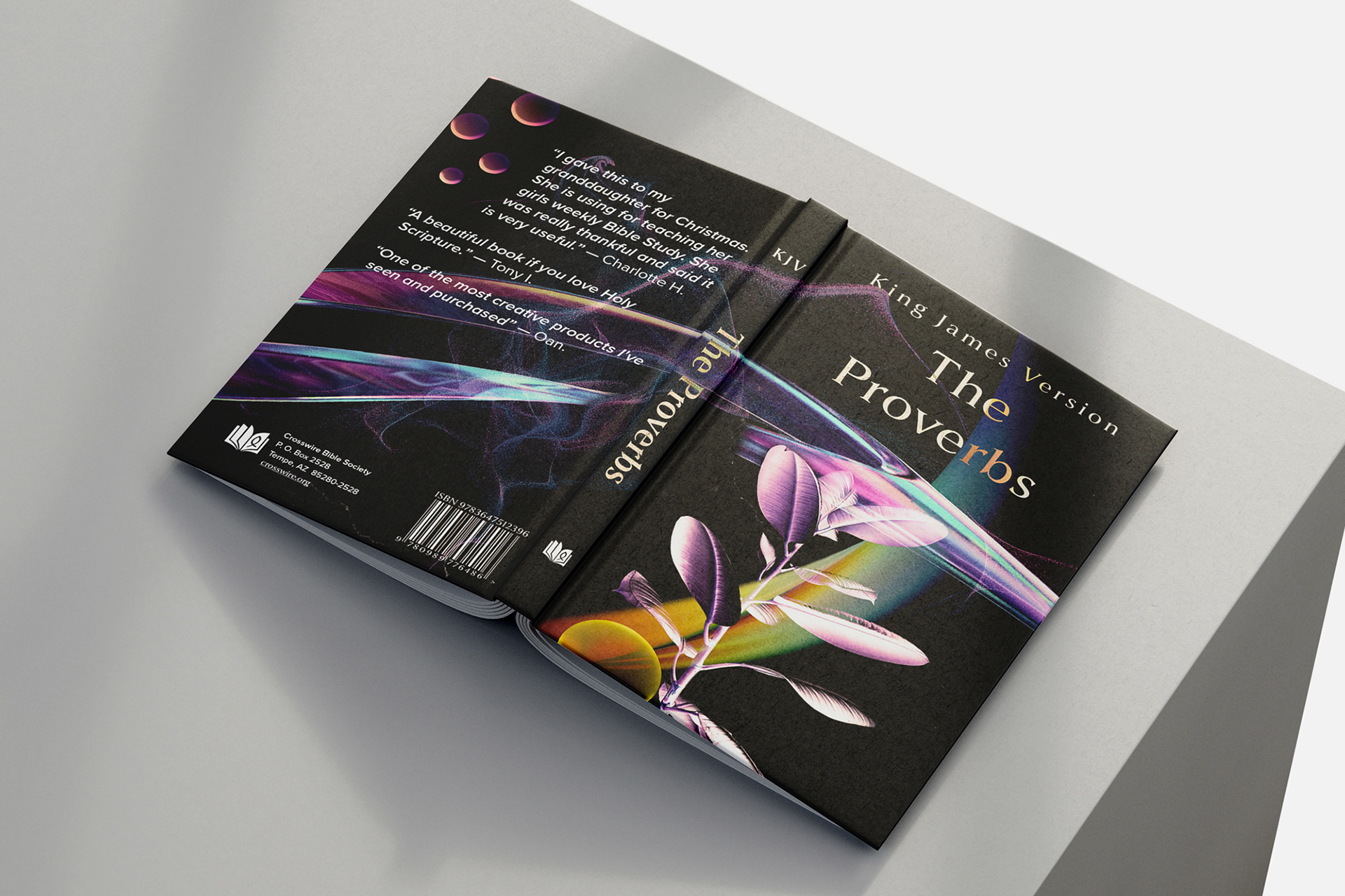
My direction with this project was the following: How could I create a visual design that would present the viewer with a preview of the contents inside the book? I chose to design a dust jacket for the book of Proverbs because it is about wisdom.
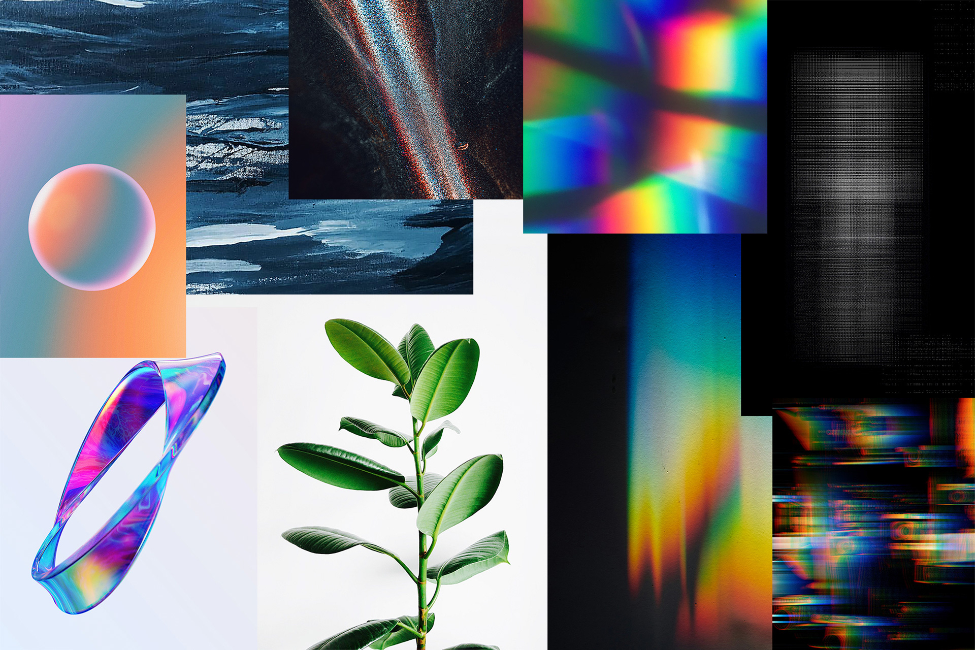
I wanted to challenge myself to visually represent a powerful idea such as that by creating a visual composition. I gathered some images from Unsplash. Some of these would later become part of the final design.
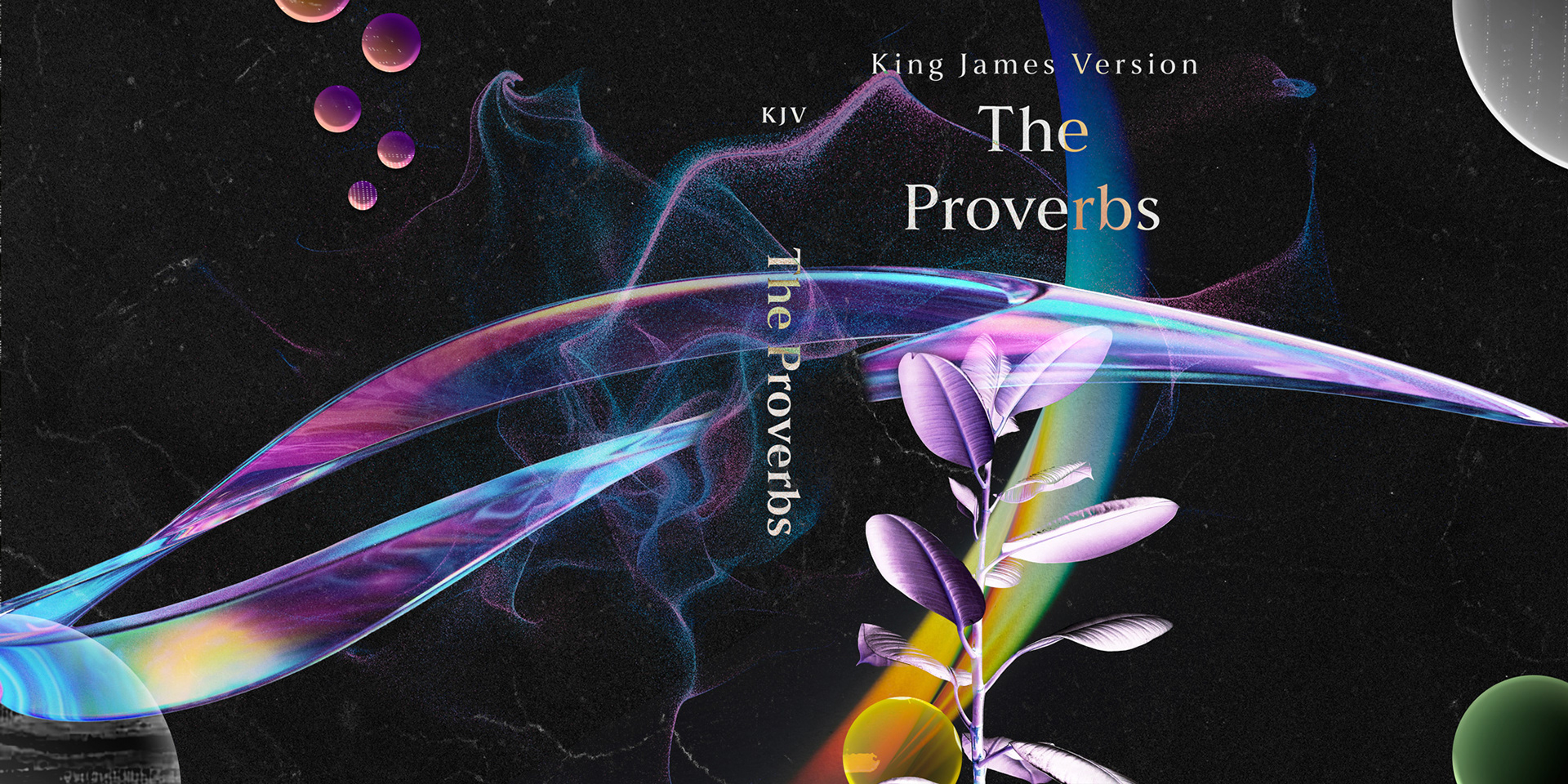
The dust jacket wisdom in the form of a growing tree on what would be the front cover of the book. The use of purple hues allows for the connection to royalty, which is further reinforced by the contents of the book. The use of yellow, orange, green and white, contrasting on a dark background, alludes to the vast content inside the book, out of which comes out the growing in wisdom.
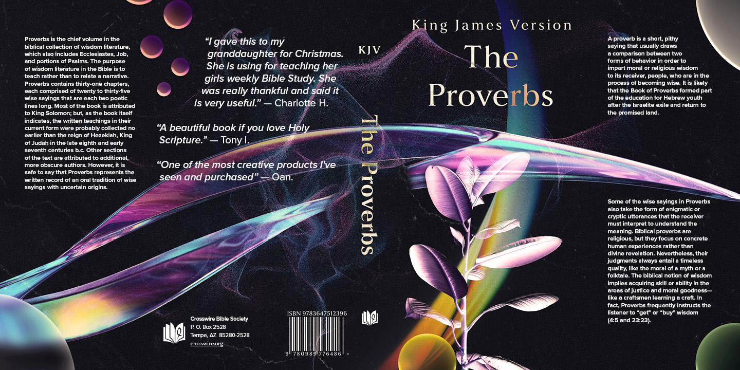
I color graded the composition so the colors would complement each other better and flow more cohesive. Lastly, I added a synopsis of the book, information about the writers of the book, as well as filled the back section with reviews that would finalize the look of the composition, making it look like a dust jacket.

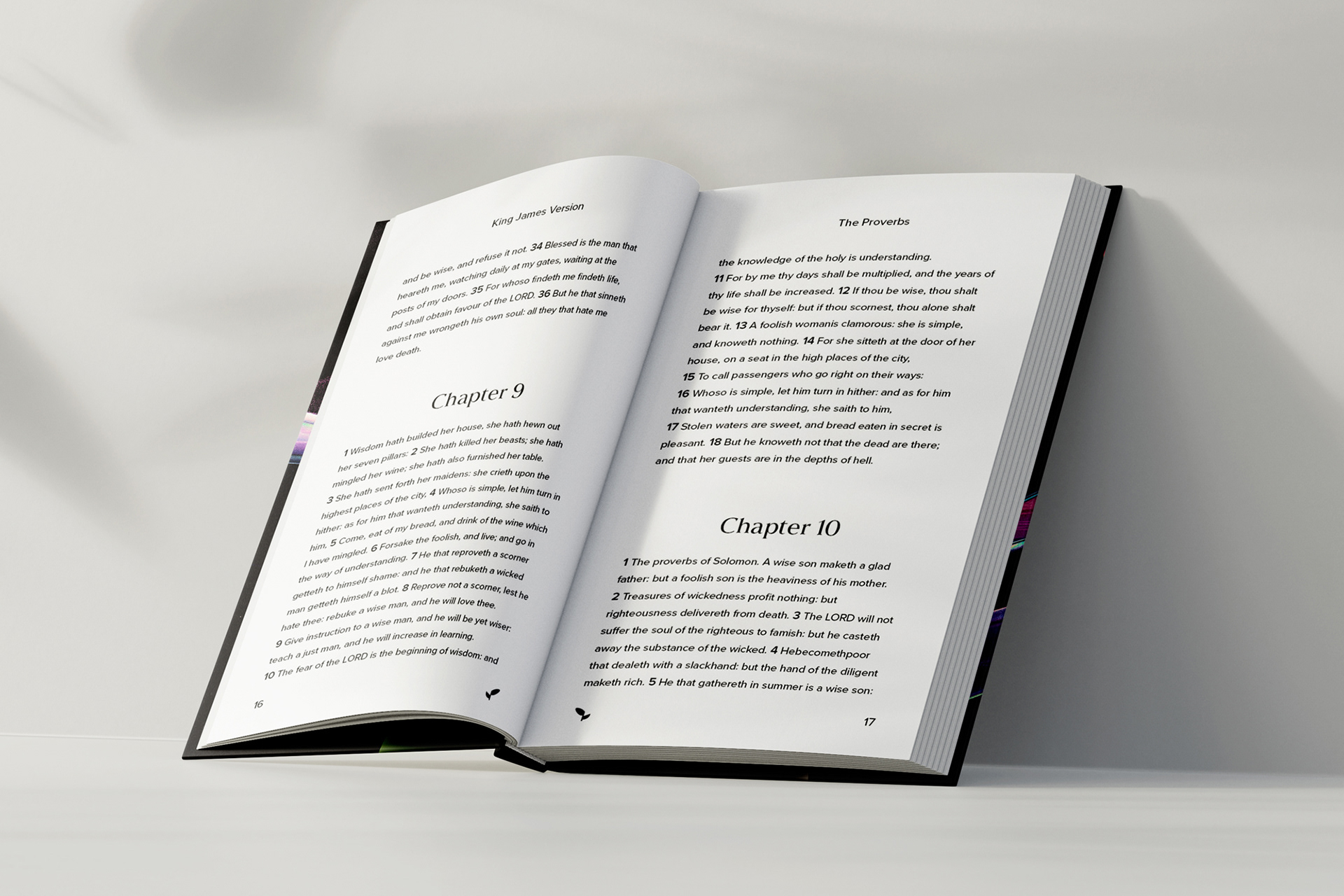
As for the content of the book, I went ahead and modernized the layout to be more readable, enjoyable, and easy to follow, allowing for the perfect balance of positive and negative space.